This film was recommended by a fellow AIBer as I research portrayals of nature in photography. The film features the work of nature photographer James Balog. His images of the changing arctic landscape are breathtaking.
http://www.chasingice.com/
http://jamesbalog.com/
Showing posts with label research. Show all posts
Showing posts with label research. Show all posts
Friday, December 13, 2013
Friday, November 15, 2013
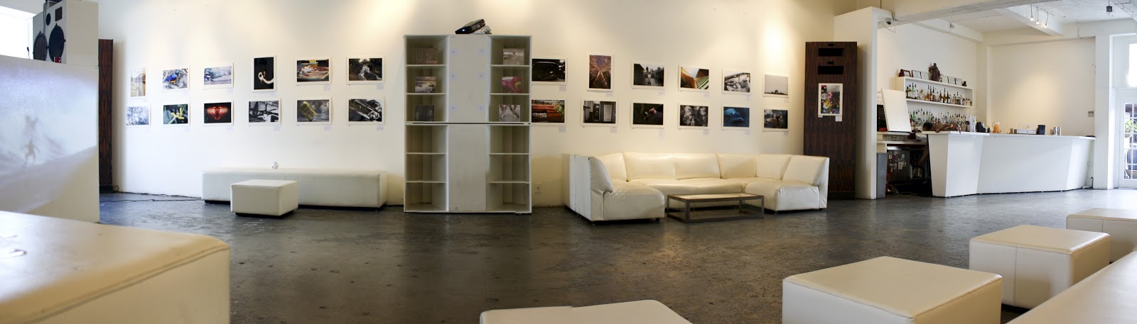
Exhibition Vertias II by Kaili Chun
This show features images of a perfomance installation by local artist and sculptor Kaili Chun. My current mentor, Jaimey Hamilton Faris, and her UH students helped with the installation at Waimanolo Beach. While I did not see the performance live last year, I found the images documented by Erin Yuasa evocative and somewhat haunting.
A quote by Chun featured at the exhibition:
"...The tensions that persist between western and indigenous ways of knowing and understanding the world, serve as catalysts for demarcating sculptural forms of containment that serve not only as reminders of the many ways in which each person is shapad and constrained, but as negoitiable boundaries between inside and outside, between concealment, and reveleatin. Who occupies whom? How do we move between the two worlds in which we live? Are we subject to the boundaries defined by others or do we delineate the boundaries that explicate our situations? The lines are not always so clear-cut."
Thursday, October 24, 2013
Article: A Conversation with Joshua Citarella
LINK TO ARTICLE: http://www.lavalette.com/a-conversation-with-joshua-citarella/
Excerpts:
"We are now in a curious position where we begin to measure ourselves against images that not only include the whole problematic nature of photography and representation, but are further complicated by a digital production."
"I’m also ready to do away with debasing words like “Photoshopped,” which simplifies a complex process by describing it as a single tool. Jargon like this is used in an overarching way to discredit or suppress new modes of production. As a result, we find ourselves in a place where Photoshop is present in nearly all art and commercial images but is largely not discussed. Even a relatively traditional photographic practice, where the computer only becomes involved when the image is outputted as a digital C-type or inkjet print, still involves a process of resampling and interpolation. The difference between resampling with Bicubic Smoother or Bicubic Sharper has real and quantifiable effects in the final image/print and these choices now need to be considered when we try to discuss things like the politics of representation. Different types of resampling techniques will describe nuanced surfaces, such as the gradient of a sunset, clouds, or skin, in noticeably different ways."
Tuesday, October 22, 2013
Hitting the Proverbial Wall – Recent Thoughts
- Looking closely at Roni Horn
- Working in series, how does a collection of visual media communicate a united message vs. 1 single piece
- Resources
- Research on Grids
- Recent Work
- Abstraction grids paying closer attention to the shifts and gradients in each square in an effort to better connect with neighboring squares
- Using photoshop to “auto align” and “auto blend” light pollution swatches did NOT work, I was hoping to explore these algorithms but alas they just simply do not “align” or “blend” swatches
- Making prints this weekend of most fall work, it will be great to spend time in the printing lab and experience these works on photographic paper
- Shooting new series looking at how the notions artificiality and the natural play out in modern day Hawaii’s landscape (contemplating a series that might discuss my interests in the collision of the artificial and natural in a more specific way)


Saturday, September 21, 2013
Artists I'm looking at
Penelope Umbrico, http://www.penelopeumbrico.net/publications/publicationspage_aperture.html
Bruna Strude, http://www.brunastude.com
(Based in Kauai)
Roni Horn, http://www.pbs.org/art21/artists/roni-horn
Paul Pfieffer, http://www.pbs.org/art21/artists/paul-pfeiffer
Brice Marden, http://www.matthewmarks.com/new-york/artists/brice-marden/
Agnes Martin, http://www.moma.org/collection/artist.php?artist_id=3787
Stephen Tourlentes, www.tourlentes.com
(Based in Boston)
Ashley Bickerton, http://www.lehmannmaupin.com/artists/ashley-bickerton
(Based in Bali)
Franco Salmoiraghi, http://www.francosalmoiraghi.com
(Based in Honolulu, HI)
Susan Derges, http://www.susanderges.com
Thursday, August 1, 2013
Artist Talk: Kosta Kulundzic’s Hawaii Apocalypse, 8/1
Article in Flux Hawaii, July 25, 2013
End of the World in Paradise
Looking forward to this artist talk on August 1. Excerpt from article:
"Kosta Kulundzic’s Hawaii Apocalypse, on display at SPF Projects until August 25, puts Saint George the Dragon Slayer, the patron saint of soldiers, chivalry, and horsemen, right in the center of paradise. This medieval legend has everything you could want: a brave hero, an evil villain, and a damsel in distress. O‘ahu becomes the unexpected setting for religious violence and comic book catastrophe."
Kosta Kulundzic’s Hawaii Apocalypse, curated by Trisha Lagaso Goldberg is currently showing at SPF Projects from July 18–August 25. An artist talk will take place on August 1 at 7 p.m.
LINK for more info:
http://fluxhawaii.com/archives/end-of-the-world-in-paradise/
Tuesday, July 30, 2013


Sunday, July 28, 2013
Recent Work: Lost & Found
These are experiments working with previous images from last semester. I'm using the latitude and longitude coordinates of where I took the image to specify their exact location via Google Maps. Paired with my somewhat ambiguous landscapes, I find the Google Maps satellite images of the same place intriguing. I'm wondering what new dialogue is sparked when paired with my rendition of the location... information accessibility online, perception of place, ways in which photography can simultaneously share information and deceive the viewer.
Still works in progress...
 |
| 21° 16' 53.20" N, 157° 42' 47.72" W |
 |
| 21° 15' 48.96" N, 157° 49' 18.71" W |
 |
| 35° 18' 17.02" N, 139° 33' 3.85" W |
Saturday, July 27, 2013
Video: Aperture Panel Abstraction in Photography, Hammer Museum
Aperture Panel: Abstraction in Photography, Hammer Museum
I found this video available on Youtube very interesting. Going to keep my eyes open for the Rexer's book due out in September 2013.
http://www.youtube.com/watch?v=qDYBJV4ylzw
Blurb: From the beginning, abstraction has been intrinsic to photography, and its persistent popularity reveals much about the medium. Artists Susan Rankaitis and James Welling and UCLA Associate Professor of Art History George Baker debate a host of approaches to the abstract photographic experience in this panel discussion moderated by Lyle Rexer, the author of The Edge of Vision: The Rise of Abstraction in Photography.
Friday, May 31, 2013
Honolulu Museum of Art visit
I'm looking forward to checking out this exhibition tomorrow as it may have some ties to my current research. Hawaii: The Mythic Landscape by Stephan Brigidi Here's a quote from the Honolulu Museum of Art website:
"A connection between the natural world and human history are central to the artistic intent of photographer Stephan Brigidi. This body of work was primarily created from 1980 to 1990, while the artist lived in Hawai’i exploring and discovering the uniqueness of the islands. The deep connection to place is intended to highlight the importance of environmental and cultural stewardship. By manipulating each print, often with paint, the natural and the human world can become a place of the mythic and the spiritual."
I'm also planning to stop by the exhibition Landscape in the New World which may serve as a supplement to my research on nature, the sublime, and the new American frontier.
I hope to have time to see Little Worlds: Video Sculptures by Tony Oursler as well!
In July, I'm even more excited to view an upcoming exhibition titled Georgia O'Keefe and Ansel Adams: Hawaii Pictures. Check out the link for more info, should be really fascinating to view depictions of Hawaii by O'Keefe and Adams.
Saturday, May 11, 2013
Camera Maintenance, the Digital Print, & Archival Storage
Ah...technology. My camera was recently shipped to the mainland for repair. The image sensor was malfunctioning on my 5D. I also sent 3 lenses for cleaning and checkup. Luckily Canon is honoring all of this under warranty and in the case of one older lens, they simply extended my warranty as a courtesy. Thank you Canon Hawaii!
As a result, I have stepped away from shooting these past few weeks and spent my time printing at the Pacific New Media digital lab with the large format Canon 8100. On May 1st, I met with mentor Scott Groeniger for our 5th meeting to show new prints and discuss progress. It was a good meeting on the direction of my work and we also discussed at length the printing process, handling archival prints, long-term photographic archival storage (especially important in Hawaii's tropical environment), and options for traveling with large (over 36in prints) to Boston in June. So much to consider both in the short term and long term!
Archival Photographic Paper
For the past year, I have been printing on Canon Polished Rag, 300 gsm paper and have grown to enjoy its luster, texture, and wide color gamut. It works especially well for my current horizon images. However, my boxes of this paper have run out and it is getting more difficult to find both locally and online. After much consideration, I decided it was time to make a switch. I bought a test box of Hahnemuhle Photo Rag Baryta paper from Kaimuki Camera (Thanks Neil for your help!) and I have to say so far it is love at first sight. The Baryta paper truly makes luscious prints and because of its extremely wide color gamut, the transition from digital image (reading light projected out from a screen) to a print (light reflected off paper) is much easier than any paper I've worked with prior. The Baryta paper is extremely fragile however. In fact, within minutes of my meeting with Scott, he quickly pointed out a few bends/kinks in the test prints due to the way I was handling it. Luckily, I learned this lesson with proofing prints... archival inkjet prints on paper like the Baryta (or Polished Rag) prints are expensive to produce. One might ask why make test prints on expensive "good stuff" and the answer is (regrettably) you have to make tests using the paper/ink you plan on eventually using. There's no other way to see how the image is being translated on the paper substrate. In any event, the Baryta Photo Rag does have some glare which may be problematic depending on where the images is eventually used but overall, I think it works very well. In the next month or so, I am hoping to purchase sample boxes from 2 paper companies (Crane Museo and Somerset) to test out new options. Even if I end up coming right back to the Baryta paper for this current project, I think it is important that I become more knowledgable as to what papers/fibers are out there and how it effects each print.
Archival Print Storage
Since my enrollment in AIB's MFA program, I have been creating more and more work that requires storage. In the past, I would create work for a specific show or client. Of course, I have remnants of old projects, framed images, test prints around the house but the issue of correct, safe, and smart photographic storage is something I haven't really dealt with head on. Now is the time to get on board. After lots of research this month, I recently purchased a massive portfolio carrying case, 2 archival ph balanced print boxes, interleaving paper, and cotton white gloves to handle the fragile Baryta paper. In the long run, all of these items are smart investments in that the prints (simply the paper and ink alone) are incredibly valuable resources. It would irresponsible (both economically and environmentally) to not store them properly. Here's to happy and healthy storage.
Traveling to Boston
I'm currently making 17x22 in prints. For June's residency, I'm planning to bring around 10-12 17x22 prints and a few larger 24x30 or 36x40 prints. I'm looking forward to bringing bigger prints but these aspirations require careful planning and logistics. I'm currently weighing the cost of photographic paper, ink, shipping and handling, and the high likelihood of traveling prints getting damaged along the way or during the residency week. I have a number of options on the table but I'm still working on my final game plan.
Saturday, April 20, 2013
Student Exhibitions: "Speak Your Truth" & "Speak Hawaii's Truth"
Last Friday marked one of my favorite days out the year. For the past four years, I've co-hosted a large student art and poetry event with Kerri Schweibert (http://kerrischweibert.com), a literature teacher at my school where I teach. It was another amazing evening celebrating student photography and spoken word! Special thanks to everyone at 39 (www.thirtyninehotel.com) who generously donated their gallery space and time.
In addition to the overall "Speak Your Truth" theme, my photography students collaborated to create a 2nd display titled "Speak Hawaii's Truth: Paradise Lost/Paradise Found." Much of this project has been driven by my current graduate research exploring the notions of paradise and escape and various depictions of Hawaii in the media and tourism industries. It has been incredibly informative (and fun) to weave my graduate research into my classroom curriculum. Even better, the exhibition was received with enthusiasm and many viewers were interested in the themes behind the work. We showcased images of beautiful isolated beaches versus congested highway traffic, tropical flowers vs littered cement sidewalks, high rise buildings versus homeless tents, surfers versus giant vessels carrying Matson containers, glowing sunsets versus graffiti walls, etc etc the list goes on. It was exciting to see this display come together and to honor my students' hard work.
Here are a few images of the event in addition to our "Speak Hawaii's Truth" display.
Sunday, March 10, 2013
Artists I'm looking at
Gregory Crewdson
New documentary on this artist's work titled "Brief Encounters." I just missed a viewing here in in Honolulu in January. I can't wait to check this out on DVD. Watch the trailer here: http://www.gregorycrewdsonmovie.com
"Acclaimed photographer Gregory Crewdon's 10-year quest to create a series of haunting, surreal, and stunningly elaborate portraits of small-town American life - filmed with unprecendented access as he makes perfect renderings of a disturbing, imperfect world."
Charlie WhiteNew documentary on this artist's work titled "Brief Encounters." I just missed a viewing here in in Honolulu in January. I can't wait to check this out on DVD. Watch the trailer here: http://www.gregorycrewdsonmovie.com
"Acclaimed photographer Gregory Crewdon's 10-year quest to create a series of haunting, surreal, and stunningly elaborate portraits of small-town American life - filmed with unprecendented access as he makes perfect renderings of a disturbing, imperfect world."
Check out this interesting article on White's work: http://www.wired.com/wired/archive/12.02/white_pr.html
"Charlie White doesn't take photographs. He constructs them. Like a Hollywood director, he orchestrates scenes, commissions sets, hires actors, and employs a visual effects team."
Ashley Bickerton
Article: Surfing Sin City with Ashley Bickerton
http://www.huffingtonpost.com/kisa-lala/surfing-sin-city-with-ash_b_895003.html
"In this new world, the white man's vision of romantic primitivism is taken for a spin by the dragon-lady's daughter. There's no victim or seducer in this tango. The garlanded belles belie their dark junkie sides. Bickerton parodies the tropes of island-exotica..."
Friday, March 8, 2013
NY Lyric Postcard Project & The 1000 Journals Project
A friend recently sent me a link to the NY Lyric Project: http://nylyricproject.tumblr.com. It's an interesting idea where a fan submits a lyric to the artist and an old (or new?) postcard is sent back to the fan with the lyrics hand-written on. Although I am moving away from working with postcards specifically, I appreciate how others are collaborating with strangers and using the postcard itself as a platform for exchange.
This also reminds me of San Fransisco based artist "someguy's" The 1000 Journals Project: http://www.1000journals.com/
"The 1000 Journals Project is an ongoing collaborative experiment attempting to follow 1000 journals throughout their travels. The goal is to provide a method for interaction and shared creativity among friends and strangers."
If interested, there's a documentary on this project, here's the trailer: http://www.youtube.com/watch?v=klnFtLGrKWU
Thursday, February 28, 2013
Bringing Non-Paradise Postcards to Life
I've been spending a lot of time looking at the work of Gregory Crewdson. His work features incredible attention to detail, unbelievable lighting, and complex relationships between characters. It subtly seduces yet is uncomfortable and beautifully familiar at the same time. I'm excited to see he documentary "Brief Encounters" highlighting his process and work when it comes out on DVD: http://www.gregorycrewdsonmovie.com


All of this comes into play as I begin to sketch out how to bring the postcards from last semester to life. I was worried that some of these are still too forced or too cheesy but after meeting with my mentor Scott, I feel as though I might be on the right track. There's much more work to do to perfect these scenes (technically and conceptually) but below shows my start. I plan to go back to each location and shoot again. I also have a number of ideas for new locations and am particularly excited to begin focusing on the island's utilities centers - water, electric, sewer, trash, etc. Even "paradise" still has to contend with urban logistics and I think utility centers are solid grounding points to use as my backdrops for the non-paradise postcards.
 |
| As a triptych. My mentor Scott and I played around with grouping these verticals and decided something might be working as a trio. |
Seascapes continued...
I currently have 2 bodies of work. One continues my work with long exposure seascapes, paying special attention to objects and/or light sources on the water. I am looking for human-made obstructions on the natural landscape. I keep coming back to the collision of the artificial & natural. I also am turning my camera inland and beginning to experiment with human interaction on the landscape. Here are a few recent examples:


Wednesday, February 6, 2013
Nation Branding & Wonder Beirut Project
2 articles forwarded by my current mentor Scott Groeniger. I found both interesting as I work through how to approach, understand, and reconcile representations of Hawaii and island culture.
1. Nation Branding: http://blog.sfmoma.org/2012/
"So, even in this (supposedly) more enlightened age, shouldn’t we still be slightly unsettled by top-down nation branding? Why do governments need to convince through PR and promotion that they are doing a good job? Or that their state is a great place to live (or at least visit)? Shouldn’t leaders just walk the walk rather than spend taxpayer money on talking the talk? And exactly whose vision and values are we promoting here?
“Attracting tourist dollars” is the easiest line of defense for such an endeavor—let’s get the word out about how great this place is!—and when cash-poor countries are now commonplace in even western Europe, who can blame them? Isn’t the innocuous “Greetings From _______!” postcard a form of nation branding? And what’s so unsettling about that? To point, if we’re going to rebrand Thailand, who better to hire than Mr. Monocle and Wallpaper himself, Tyler Brulée, and his creative firm, Winkreative, stripping away that sleazy veneer often associated with Bangkok to reveal the more streamlined, industrious and benign paradise (complete with Euromodern styling) that really exists? Still, a question that lingers is if the campaign actually illuminates previously unearthed Thai treasures or is a whitewash sanding down of the country’s rough edges. It’s one thing to exaggerate a product’s effectiveness, another to misrepresent an entire sovereign state."
2. Joana Hadjithomas & Khalil Jorige: http://hadjithomasjoreige.com/
THE STORY OF A PYROMANIAC PHOTOGRAPHER
"The story of a pyromaniac photographer is the first part of this project.
Between 1968 and 1969, Abdallah Farah was commissioned by the Lebanese State to take pictures to be edited as post cards. They represented the Beirut Central District and mainly the Lebanese Riviera and its luxury hotels, which contributed to form an idealized picture of Lebanon in the sixties.
Between 1968 and 1969, Abdallah Farah was commissioned by the Lebanese State to take pictures to be edited as post cards. They represented the Beirut Central District and mainly the Lebanese Riviera and its luxury hotels, which contributed to form an idealized picture of Lebanon in the sixties.
Those same postcards are still on sale nowadays, although most of the places they represent were destroyed during the armed conflicts.
As of the autumn of 1975, Abdallah Farah systematically burned the negatives of the postcards, in accordance with the damages caused to the sites by the shelling and street fights. Abdallah used to photograph the image after each new burn he inflicted on it, producing a series of evolving images, which we call the “process”.
We distinguish two types of processes: The first, which we called the ‘historic process' follows very faithfully the events. Several battles have been documented this way among them 'The battle of the hotels' that occurred from 1975 to 1976. In Beirut. The second derives from the impacts which Abdallah inflicted willfully or accidentally to certain images which we grouped under the name 'plastic process'."
We distinguish two types of processes: The first, which we called the ‘historic process' follows very faithfully the events. Several battles have been documented this way among them 'The battle of the hotels' that occurred from 1975 to 1976. In Beirut. The second derives from the impacts which Abdallah inflicted willfully or accidentally to certain images which we grouped under the name 'plastic process'."
Friday, January 4, 2013
Highlights: Museum of Fine Art Boston
 |
| Entrance panel to Ori Gersht Exhibit "History Repeating" |
 |
| This was a serendipitous exhibit given my semester's interest in and creation of postcards. |
 |
| Entrance panel to the MFA's exhibition titled "The Postcard Age" |
 |
| The exhibit showcased postcards of all kinds. This selection highlighted some interesting travel-themed cards although I did not find any depicting Hawaii. |
 |
| Entrance panel to the fashion photographer Mario Testino's "In Your Face" exhibit. The walls were covered MASSIVE, vivid, intense, and wild fashion images. |
Wednesday, January 2, 2013
Highlights: East Coast Museum Visits
Visiting
the east coast means catching up on as many art exhibitions as possible!! I was
able to get to Philly, New York, and of course I’ll be in Boston for the
upcoming residency. While it feels there is never enough time to see everything
on my list, the highlights of my museum hopping are listed below. I was
reminded (in New York in particular) how tricky museum-going can be during the
holiday season. I battled long lines, advance ticket booths, and LOTS of crowds
to check out some great exhibits. A big one I missed this year was MOMA in New
York, unfortunately, but I hope to be back in June. In the list below, I’ve
written down artists of particular interest from each show.
Museum
of Fine Art, Boston, MA Ori Gerscht: History Repeating
Visiting tomorrow...
Metropolitan
Museum of Art, New York, NY
Faking It: Manipulated Photography Before Photoshop
This was a fascinating look into the medium’s ability to portray
“truth.” Long before Photoshop, photographers have stitched negatives,
manipulated, prints, omitted or added details, layered scenes (the list goes
on…) to produce a desired result. Great show! And, it was particularly exciting
to see my current AIB Oliver Wasow’s artwork featured in this exhibition.
Congrats Oliver!
Gerhard Richter, Kathy Grove, Oliver Wasow, Duane Michals, Frank Majore, Clarence
John Laughlin, Wanda Wulz, Claude Cahun, Ralph Bartholomew Jr.,
 |
| Entrance to Faking It: Manipulated Photography Before Photoshop at The Met |
Regarding Warhol: Sixty Artists
Hiroshi Sugimoto, Jean-Michel Basquiat, Vija Clemins, Nan
Goldin, Andreas Gursky, Jeff Koons, Cindy Sherman, Matthew Barney, Félix
González-Torres, Ai Weiwei
Whitney
Museum, New York, NY
Sinister
Pop
Looking
at Pop Art and its relation to darker themes surrounding politics, war,
representations of women, dystopias, etc. This was an inventive theme to pursue
within the Pop Art genre and I really enjoyed the exhibition overall.
Peter
Saul, Ching Ho Cheng, Lucas Samaras, Allan D’Arcangelo
Wade
Guyton
Interesting
to see Guyton’s artwork in person given the WSJ article about photography &
painting I posted last week.
Philadelphia
Art Museum, Philadelphia, PA
Double Portrait: Paula Scher and Seymour Chwast, Graphic
Designers
I teach a typography unit featuring Paula Scher in my high
school graphic arts class. It was great to have the chance to her posters
life-size and to browse new projects she is pursuing.
 |
| Gallery Wall of Paula Scher's Work at Philadelphia Art Museum |
Dancing around the Bride: Cage, Cunningham, Johns,
Rauschenberg, and Duchamp
Extensive collection of work from all five artists. I needed
more time to tackle this large show. I appreciated seeing some of the work I
was reading about in The Big Archive in person.
 |
| Entrance to Dancing Around the Bride: Cage, Cunningham, Johns, Rauschenberg, and Duchamp at Philadelphia Art Museum |
Treasures from the Alfred Stieglitz Center: Photographs from
the Permanent Collection
Man Ray, Alfred Stieglitz, Edward Weston, Gerhard Richter, Masahisa Fukase, Shomei Tomatsu, Hiroh Kikai, Adolphe Braun, Joachim Koester
 |
| Entrance to Philadelphia Art Museum Photography Collection |
Thursday, December 27, 2012
WSJ Article: Where Painting and Photography Blur
Article: Where Painting and Photography Blur
By: Richard B. Woodward
Link: http://online.wsj.com/article/SB10001424127887323777204578191720734339006.html
Quick, interesting article. Artists mentioned include Wade Guyton, Gerhard Ricther, Alfred Leslie, & James Welling.
"Several New York shows in the past six months indicate that painting and photography remain locked in an uneasy, codependent relationship but have also learned to feed off each other in the digital era as never before."
"Debates about the sway of machines on picture making are not new. Nor are they ever settled. Photographers and paintings have borrowed freely from each other - there were hand-tinted photographs in the 19th century and photorealist painters in the 20th century - even as they struggled to establish their own artistic identity and supremacy."
Subscribe to:
Posts (Atom)